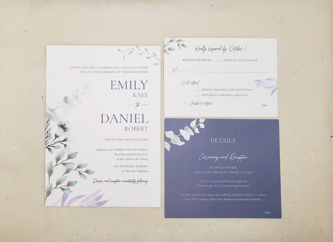
Emily and Danny got married at a dreamy vineyard in California. When they got in touch with me to create invitations that were elegant, simple, and incorporated different shades of blue with just a touch of floral, I couldn’t wait to get started.
Something the couple wanted from the beginning was for their invitations to match the elegance of their venue. Despite the wedding being in October, Emily was committed to having steel blue bridesmaid dresses, and for that color to be a theme throughout the event and paper goods.
“I think a lot of people would think October would be oranges and more fall colors, but I really wanted the blue so we just went with it,” Emily said. “So we went with a dusty blue for the main color, and then to bring in some fall colors we had little pops of burgundy to bring it all together.”
From the invitations to the suite of day-of paper goods Serif & Spice designed, careful details were woven throughout the couple’s stationery products. For example, the invitation suite was tied together with a dusty blue ribbon, and the same ribbon was used to tie designed tags to the keepsake wine stoppers the couple gave to their guests.

Photo by Marissa Kelly Photography
One of Emily’s requests for the invitations was to have “just a touch of floral,” and the greenery art with minimal flowers appeared in each piece. Many pieces remained the white of the paper used, while certain statement pieces, like the details card, popped by being the dusty blue color.
“I loved that we made the details card dusty blue,” Emily said. “That way it stood out and made it a little different. It gained that pop because we had three pieces and it didn’t look like everything blended together.”

Photo by Marissa Kelly Photography
Another one of their main colors was navy blue, which was the color of the groomsmen suits. To incorporate it into the invitations, we used navy envelopes with white ink for both the invitation envelopes and the reply cards.
“I thought it would pop in the mail when people receive it, it just shows that, ‘oh, this is something different,’” Emily said.

At first, the couple wasn’t sure if they wanted the invitations to reflect the fact that their wedding was at a vineyard. However, we were able to tie in that piece in a way that made it special for the two of them but wasn’t overbearing - a simple vine that occurred throughout the pieces. It ended up being one of Emily’s favorite details of the stationery.
“That brought in a very subtle vineyard feel to it,” she said. “It’s a little detail that some people might not have caught onto, but I loved that personally. It just made it feel like, ‘oh, we’re going to a vineyard.’”
With the blues to represent the dresses and suits, the vines, and the ribbons, Emily felt that the stationery represented the day seamlessly.
“Any time I look at the invitation, I feel like it encapsulates the whole day,” Emily said. “I just feel like the vibe of it matched the elegance that we were going for and it matched the venue, so I feel like it’s a good representation of everything I was going for.”
Something that was important to Emily and Danny was weaving in details that were significant to them, their day, and their relationship.
“When we were planning the wedding, one of my friends was saying to me that every wedding should be a representation of the couple,” Emily said. “They're all supposed to be different and the invitations should be the same way. If the invitation represents the day, and every day is unique, then every invitation should be unique, too. That was a good thing to keep in mind, my decisions are going to be different than everyone else’s, and that’s a good thing.”

Photo by Marissa Kelly Photography
It was such an honor to tie in all of Emily and Danny’s incredibly thoughtful details to their stationery. It truly is the little details that makes a wedding, or an invitation design, all the more special.
Ready to make invitations that are uniquely you? Feel free to reach out with any questions!

